Proza Libre
Google Fonts · Jonas Enge · 2016
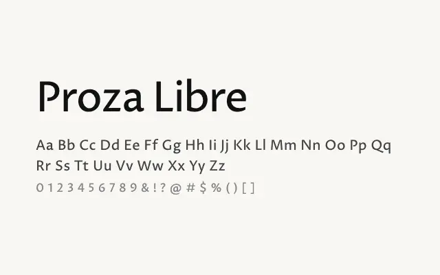
A warm, calligraphically informed humanist sans that performs equally well in long text and at display sizes.
About
Proza Libre strikes a balance between the geometric clarity of a modern sans and the warm legibility of a humanist design, making it a versatile choice for editorial and interface work. Its open apertures and generous x-height ensure strong readability in body copy, while the range of weights supports varied typographic hierarchies. It works particularly well for longform web articles, reports, and brand identities that need approachability without sacrificing sophistication.
Classification
Proza Libre is a humanist sans-serif with warm, open apertures and a rhythm that bridges text and display applications. It draws on Renaissance calligraphic proportions, giving it a legible and approachable character across multiple weights.