Public Sans
Google Fonts · USWDS / Philabaum · 2019
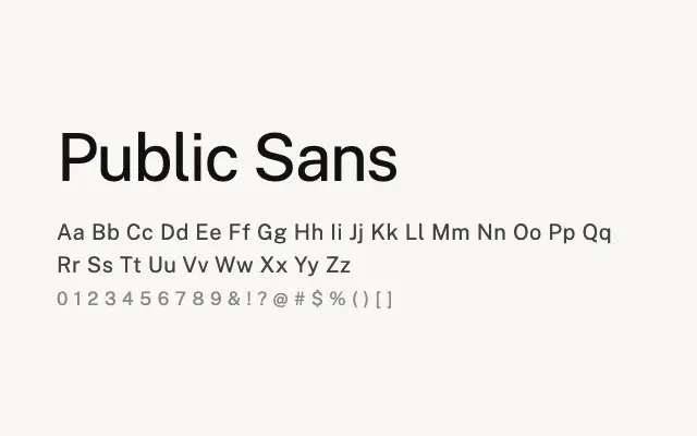
A rigorously neutral grotesque sans built for government digital services, excelling in UI and screen contexts.
About
Public Sans was designed to serve the United States federal government's digital design system, prioritising clarity, neutrality, and performance across interfaces. Its even spacing and restrained forms make it an ideal workhorse for data-heavy dashboards, form interfaces, and public-facing digital products. The extensive weight range supports sophisticated typographic hierarchies without the face ever calling attention to itself.
Classification
Public Sans is a neutral, utilitarian grotesque developed by the United States Web Design System, drawing on Libre Franklin as a starting point but with tighter spacing and more regulated letterforms. It prioritises legibility and system compatibility across sizes.