seriftransitional serif
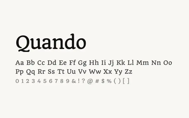
A refined, quietly elegant transitional serif suited to editorial and literary text use.
About
Quando brings a gentle sophistication to body text, with well-balanced proportions and moderate contrast that read comfortably at both text and display sizes. Its understated character makes it a reasonable choice for magazine layouts, book pages, or any editorial context calling for restrained elegance. The single weight is a meaningful limitation for complex typographic hierarchies.
Classification
Quando is a delicate transitional serif with refined proportions, moderate stroke contrast, and slightly bracketed serifs. It has an elegant, understated quality that suits editorial settings.
Weights
Regular
Languages
LatinLatin Extended
Tags
seriftransitionaleditorialtextbodycleanfashionfreeopen-source