Quattrocento
Google Fonts · Pablo Impallari · 2011
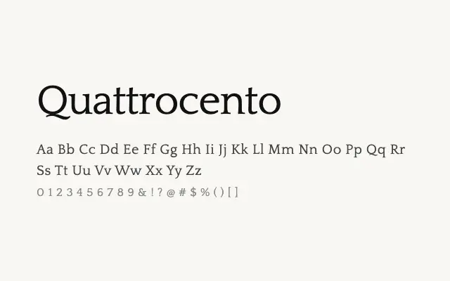
A dependable Renaissance-inspired serif with classical proportions and strong readability credentials.
About
Quattrocento draws on the rich tradition of fifteenth-century Italian typefaces, delivering sturdy, warm letterforms that hold up well across print and screen contexts. Pablo Impallari's careful spacing and open counters make it a reliable choice for long-form editorial work, books, and websites where sustained reading comfort is a priority. It pairs naturally with its companion Quattrocento Sans.
Classification
Quattrocento is a classical Old Style serif rooted in Italian Renaissance typefaces, with low stroke contrast, angled stress, and sturdy bracketed serifs. It is designed explicitly for comfortable long-form reading.