Quattrocento Sans
Google Fonts · Pablo Impallari · 2011
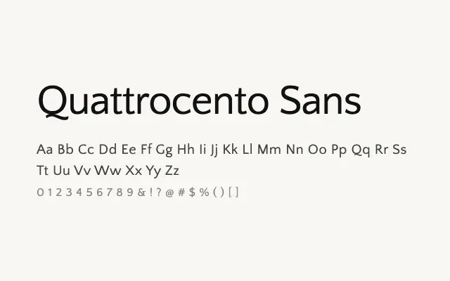
A warm humanist sans designed in harmony with Quattrocento, bringing classical sensibility to sans-serif typography.
About
Quattrocento Sans inherits the measured, Renaissance-informed proportions of its serif sibling, making it an unusually coherent pairing across a single typographic system. Its open letterforms and comfortable spacing make it equally viable as a body face or a supporting display element. Designers working on editorial, academic, or cultural projects will find it a dependable and harmonious choice.
Classification
Quattrocento Sans is a humanist sans-serif designed as a companion to Quattrocento, sharing its classical proportions and warm, open character while removing the serifs for a cleaner modern application.