Raleway
Google Fonts · Matt McInerney · 2010
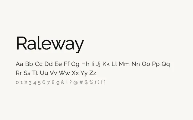
A sleek geometric sans with a distinctive elegance that lends itself naturally to fashion and lifestyle branding.
About
Originally conceived as a single-weight display face by Matt McInerney and later expanded by Pablo Impallari, Raleway has become one of the most popular geometric sans-serifs on Google Fonts. Its refined proportions and subtle quirks — particularly the characteristic 'W' — give it a polished, high-fashion quality that suits luxury branding, editorial headers, and lifestyle websites. The extensive weight range means it can carry a whole typographic system on its own.
Classification
Raleway is a refined geometric sans with elegant thin-to-black weight range, characterised by distinctive letterforms such as the double-storey 'w' and single-storey 'a'. Its high-fashion sensibility sets it apart from strictly functional geometric faces.