sans-serifhumanist sansitalic
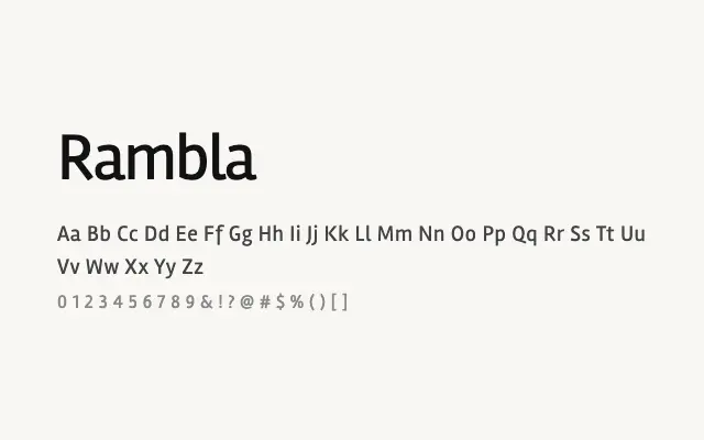
A quiet, neutral humanist sans that prioritises legibility and unobtrusiveness over stylistic flair.
About
Rambla occupies the practical middle ground of humanist sans-serifs — open enough to read comfortably at text sizes, neutral enough to avoid drawing attention to itself. Its two-weight family (Regular and Bold) makes it straightforward to deploy on websites and in UI contexts where typographic complexity is unwanted. It will not win prizes for personality, but it is a competent, reliable choice for body copy and interface text.
Classification
Rambla is a modest, low-key humanist sans-serif with open apertures and a neutral character that sits somewhere between geometric efficiency and humanist warmth. Its limited weight range keeps it simple but usable.
Weights
RegularBold
Languages
LatinLatin Extended
Tags
sans-serifhumanistbodytextscreenneutralcleanuifreeopen-source