Rationale
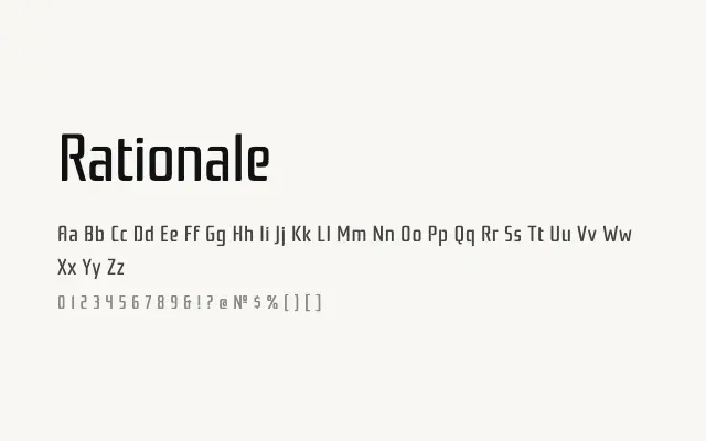
A restrained geometric sans with minimal personality and clean legibility, built for functional screen and interface use.
About
Rationale strips back ornament to deliver a quietly functional geometric sans that performs reliably in UI contexts and digital body text. Its neutral character means it rarely asserts itself, which is precisely its strength in interface design where the type should support content rather than compete with it. The single weight is a practical limitation, but for projects requiring a simple, unobtrusive workhorse sans it is a solid option.
Classification
A clean, minimalist geometric sans-serif with near-monolinear strokes and simple, open letterforms. The design prioritises neutrality and legibility, with a restrained character that leans towards UI and screen applications.