displaydisplay serif
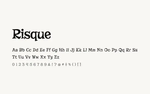
A heavily ornamental Victorian-inflected display serif with inline detailing and dramatic contrast.
About
Risque draws on nineteenth-century wood-type and decorative printing traditions, making it well suited to poster headlines, event branding, and packaging that calls for period charm. Its inline strokes and thick-thin contrast give it visual weight even at large sizes. It functions as a single-weight novelty face and should be deployed sparingly for maximum impact.
Classification
Risque features ornate, high-contrast letterforms with decorative inline detailing and strong period flavour. The design leans into Victorian-era display aesthetics with heavy bracketed serifs and embellished strokes.
Weights
Regular
Languages
LatinLatin Extended
Tags
displaydecorativevintageretrohigh-contrastposterserifexpressivefreeopen-source