serifslab serifitalic
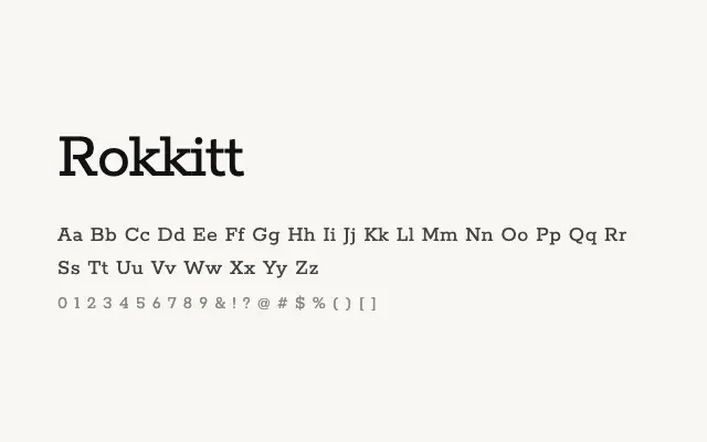
A clean, geometric slab serif with an impressive weight range that performs reliably across both headline and body settings.
About
Rokkitt's consistent stroke width and squared serifs give it a modern, structured feel that reads well on screen and in print. The family's span from Thin to Black, combined with Vietnamese and extended Latin support, makes it a genuinely useful workhorse for editorial, branding, and digital product design. It occupies a middle ground between approachable and authoritative, which is a useful quality.
Classification
Rokkitt is a geometric slab serif with sturdy, even-weight strokes and squared serifs that give it a clean, confident rhythm on screen. The wide weight range from Thin to Black makes it a genuinely versatile family.
Weights
ThinExtraLightLightRegularMediumSemiBoldBoldExtraBoldBlack
Languages
LatinLatin ExtendedVietnamese
Tags
slabserifgeometricheadlinebodybrandingvariableworkhorsefreeopen-source