Sanchez
Google Fonts · Daniel Hernández · 2012
serifslab serifitalic
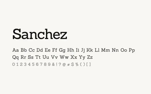
A dependable slab serif with even stroke contrast and solid bracketed serifs that works confidently across both display and text settings.
About
Sanchez draws on the Egyptian slab tradition, delivering consistent stroke weights and well-proportioned letterforms that hold up at small sizes and large headlines alike. It suits editorial design, magazine layouts, and branding projects that require a serif with personality but not flamboyance. Its extended Latin coverage makes it a practical choice for multilingual publishing.
Classification
Sanchez is a sturdy slab serif with low contrast strokes and robust, bracketed serifs. Its even texture and solid construction give it a reliable, editorial character.
Weights
Regular
Languages
LatinLatin Extended
Tags
slabserifeditorialheadlinebrandingbodyworkhorsefreeopen-source