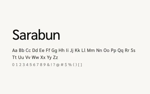
A well-considered humanist sans designed for Thai–Latin bilingual use, with an extensive weight range that makes it a genuinely capable workhorse.
About
Sarabun addresses the specific challenge of maintaining visual consistency between Thai and Latin letterforms, producing a typeface where both scripts feel like genuine partners rather than awkward companions. Its eight weights — from Thin to ExtraBold — make it suitable for complete typographic systems, from body text to display headlines. It is an excellent choice for any project requiring readable, neutral type across Thai and Latin content.
Classification
Sarabun is a clean, legible humanist sans designed specifically for both Thai and Latin scripts, with an extensive weight range ensuring typographic flexibility. Its design prioritises readability and harmony between the two script systems.