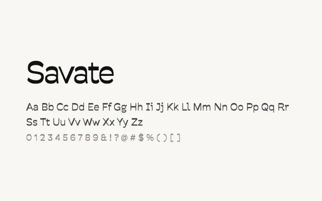
A well-considered geometric sans with a broad weight range and clean construction suitable for both display and text.
About
Savate offers eight weights from ExtraLight to Black, giving designers strong hierarchical control across a single typeface family. Its geometric basis is tempered by subtle humanist touches that maintain legibility at smaller sizes, making it a credible choice for UI, editorial, and branding work. The Latin and Latin Extended coverage keeps it practical for a wide range of Western European typographic contexts.
Classification
Savate is a contemporary geometric sans-serif with a wide weight range and clean, rational letterforms that sit comfortably across both display and text applications. Its proportions are well-balanced with subtle optical corrections that prevent the sterility common to purely mechanical geometrics.