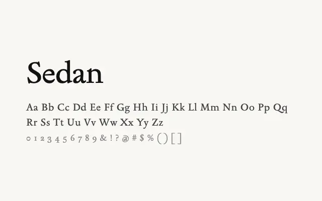
A classically proportioned humanist serif with old-style sensibilities, suited to refined editorial and long-form text.
About
Sedan draws from the broad tradition of Renaissance and early modern text typefaces, offering warmth and readability in flowing prose. Its humanist stroke contrast and bracketed serifs give it a slightly traditional character that pairs well with literary and editorial contexts. The Regular weight alone makes it suitable as a primary reading font on screen, though the lack of heavier weights limits its range in typographic hierarchies.
Classification
Sedan is a classical text serif drawing on Renaissance and old-style proportions, with humanist stroke contrast and bracketed serifs. It is designed for sustained reading in print and editorial digital contexts.