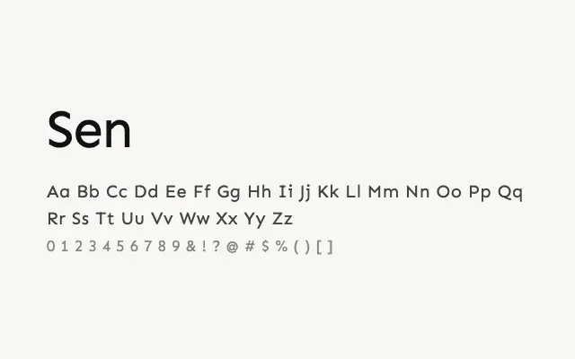
A clean, friendly geometric sans that navigates confidently between UI practicality and editorial warmth across multiple weights.
About
Sen's open apertures and even stroke contrast give it strong legibility on screen at small sizes, while its weight range from Regular to ExtraBold provides sufficient hierarchy for complete typographic systems. It sits comfortably alongside more expressive typefaces without competing, making it a reliable choice for app interfaces, dashboards, and clean editorial layouts. Its geometric underpinning also lends it a polished quality suitable for contemporary branding.
Classification
Sen is a clean, geometric sans-serif with a friendly, open character drawn from near-perfect circular forms and consistent stroke widths. It balances geometric rigour with enough humanist warmth to remain approachable across UI and editorial contexts.