Shadows Into Light Two
Google Fonts · Kimberly Geswein · 2012
scripthandwritten script
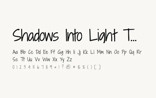
A marginally more refined take on Shadows Into Light, sharing its casual handwriting charm with slightly cleaner execution.
About
Shadows Into Light Two maintains the warm, informal handwriting character of its predecessor while offering improved letter spacing and overall consistency. The differences between the two are subtle, making this the preferable choice when a touch more polish is needed without sacrificing personality. It suits the same informal, expressive contexts as the original.
Classification
A refined companion to Shadows Into Light, with subtly improved spacing and letterform consistency while retaining the same casual handwriting aesthetic. The 'Two' variant offers slightly more polished execution.
Weights
Regular
Languages
LatinLatin Extended
Tags
scriptdisplayplayfulfriendlyexpressivefreeopen-source