Signika
Google Fonts · Anna Giedryś · 2011
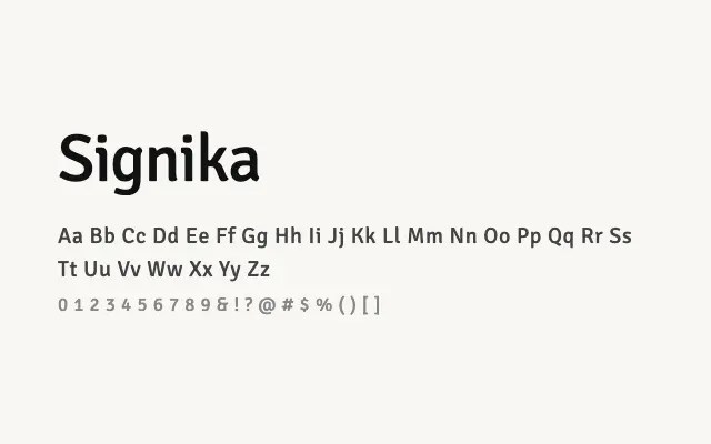
A humanist sans designed from the ground up for signage and screen legibility, with open forms and a subtle warmth that works across a wide range of sizes.
About
Signika was developed with wayfinding and signage in mind, resulting in a typeface with unusually open apertures, careful spacing, and forms that resist confusion at both small and large scales. It performs equally well in interface design, long-form text, and heading hierarchies, offering a more characterful alternative to neutral grotesques. The family's range of weights makes it a practical, flexible workhorse for editorial and digital product work.
Classification
Signika is a signage-inspired humanist sans-serif designed for legibility at small sizes and from a distance, with low stroke contrast, open apertures, and slightly quirky letterforms. It was conceived specifically to address legibility challenges in signage and UI contexts.