Signika Negative
Google Fonts · Anna Giedryś · 2011
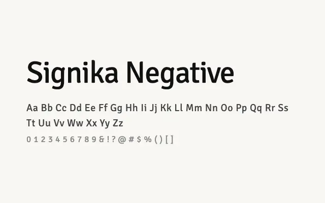
The reversed-out sibling of Signika, engineered specifically for white-on-dark legibility with optically compensated forms and spacing.
About
Signika Negative addresses the well-known problem of stroke spread in reversed-out typography, where white letterforms on dark backgrounds appear heavier and tighter than their positive counterparts. Its adjusted metrics and subtle form modifications ensure that text remains equally legible whether light or dark backgrounds are used, making it a thoughtful choice for interfaces that switch between modes. It is best used in tandem with Signika for consistent cross-background typographic systems.
Classification
Signika Negative is a companion to Signika, adapted for reversed-out (light on dark) display conditions through adjusted spacing and slightly modified forms that compensate for optical spread on dark backgrounds. It shares Signika's humanist construction and open apertures.