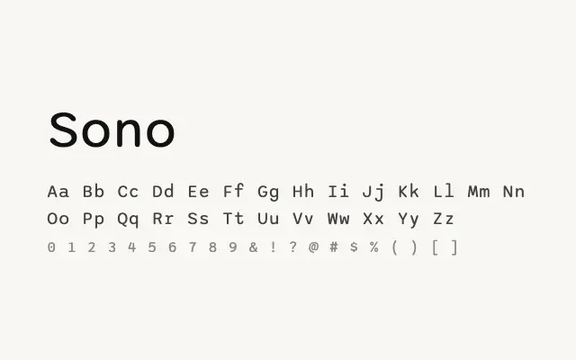
An inventive variable sans that spans proportional and monospaced spacing in a single, cohesive family.
About
Sono's defining feature is its variable spacing axis, allowing it to shift from conventional proportional text to fully monospaced output within the same typeface. This makes it exceptionally practical for interfaces that mix prose and code, or for designers who want typographic consistency across varied content types. Its clean, open letterforms hold up well at small sizes on screen, and the Vietnamese script support broadens its international utility.
Classification
Sono is a variable sans-serif that transitions between proportional and monospaced spacing, offering a distinctive and practical design that serves both running text and technical display. Its clean, geometric-leaning forms are friendly without being overtly playful.