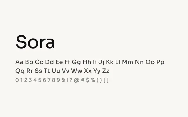
A refined geometric sans with a digital-native sensibility that works cleanly across UI, branding, and headline contexts.
About
Sora strikes a balance between geometric precision and humanist warmth, avoiding the coldness of strict geometric sans designs while remaining modern and unobtrusive. Its generous x-height and open apertures ensure strong legibility at small sizes on screen, making it a solid choice for product interfaces and app design. The eight-weight range from Thin to ExtraBold gives it the versatility to carry an entire typographic system on its own.
Classification
Sora is a clean, humanist-leaning geometric sans with even stroke weights and open apertures that give it a contemporary, digital-native feel. Its balanced proportions and generous x-height make it well suited to screen interfaces and product design.