Space Grotesk
Google Fonts · Florian Karsten · 2020
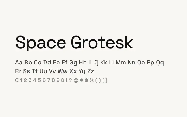
A characterful geometric grotesque with deliberate quirks that set it apart from neutrality without compromising usability.
About
Space Grotesk was developed from the proportions of Space Mono but reworked as a proportional typeface, retaining some of the mono's distinctive angularity in its terminals. Those idiosyncratic details make it a natural fit for technology branding, editorial headlines, and digital product design where a touch of personality is welcome. Its five weights cover most practical needs, and it holds up well at both display and interface sizes.
Classification
Space Grotesk occupies a distinctive middle ground between geometric and grotesque sans traditions, with deliberate quirks in letter construction — most notably the angular terminals and idiosyncratic details — that give it personality without sacrificing legibility. Its proportions and weight range suit both display and UI work.