serifdisplay serif
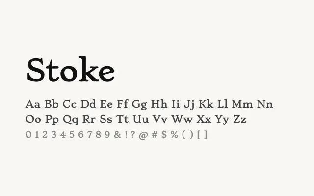
A refined display serif with noticeable stroke contrast and an understated elegance.
About
Stoke carries the hallmarks of a fashion-adjacent editorial serif — clean lines, moderate contrast, and letterforms that hold up well at headline sizes. Its Light and Regular weights are both appropriate for magazine headers, branding, and editorial layouts where sophistication is the priority. It is less suited to extended body text, where the limited weight range would become a constraint.
Classification
A serif face with pronounced stroke contrast and refined detailing, available in Light and Regular weights. The design has an editorial quality with elegant proportions suited to display rather than continuous text.
Weights
LightRegular
Languages
LatinLatin Extended
Tags
displayserifeditorialheadlinehigh-contrastfashionbrandingfreeopen-source