Strichpunkt Sans
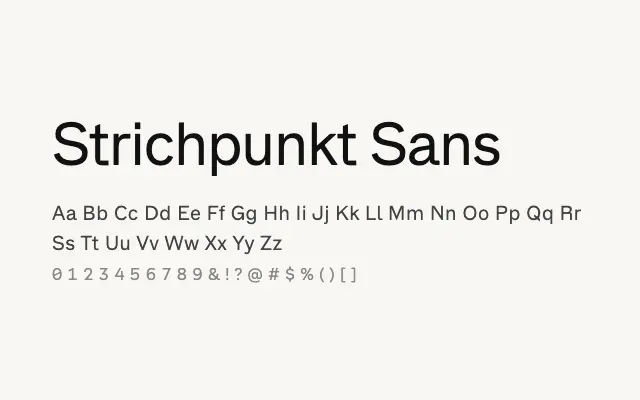
A well-weighted geometric sans with a broad range of weights suited to contemporary branding and editorial work.
About
Strichpunkt Sans offers a confident geometric construction with enough weight variation — from Regular to Black — to build meaningful typographic hierarchy within a single family. Its clean forms and open apertures translate well across both screen and print contexts, from UI design to headline typography. The family has a modern Swiss quality that makes it adaptable to branding, editorial, and packaging without feeling generic.
Classification
A clean geometric sans-serif with a wide weight range from Regular through to Black, featuring consistent stroke construction and open apertures. The design leans toward modern utility with a structured, considered appearance.