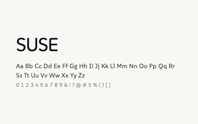
A soft, rounded geometric sans with a broad weight range, designed with screen interfaces and open-source culture in mind.
About
SUSE balances geometric structure with gently rounded terminals, giving it a warm and approachable personality without sacrificing clarity. The nine-weight range from Thin to Black makes it genuinely versatile across display and text sizes, and its clean construction ensures legibility on screen. It is well suited to product interfaces, developer tools, and tech branding where a friendly but professional tone is required.
Classification
SUSE is a soft geometric sans-serif with subtly rounded terminals and a friendly, open character, covering an unusually wide weight range from Thin to Black. Developed with associations to the SUSE Linux project, it is optimised for screen and interface use.