Syncopate
sans-serifgeometric sans
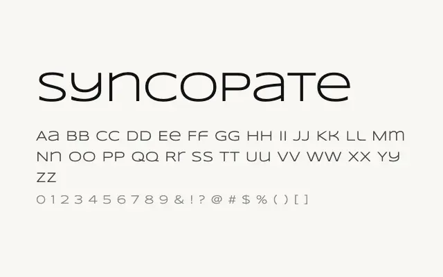
A wide, uppercase-driven geometric sans with a bold architectural presence designed purely for display impact.
About
Syncopate's generous letter spacing and near-monolinear strokes give it a cold, modernist quality reminiscent of titling faces used in science fiction and technical branding. It works well for short headlines, logotypes, posters, and motion graphics where typographic authority is more important than warmth. Its limited weight range and poor small-size performance make it a one-trick specialist.
Classification
Syncopate is a stark, wide geometric sans-serif with uppercase-dominant construction, open spacing, and a strong architectural quality. It is built for impact at large sizes rather than text legibility.
Weights
RegularBold
Languages
LatinLatin Extended
Tags
sans-serifgeometricdisplayheadlinewideboldbrandingposterfreeopen-source