Syne
Google Fonts · Bonjour Monde · 2017
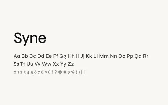
A culture-sector geometric sans whose ExtraBold weight pushes into genuinely experimental display territory.
About
Syne was originally created for the Synchrotron SOLEIL arts programme, and its design reflects that cultural context — clean and functional in lighter weights, daringly idiosyncratic at the heavy end. The ExtraBold features manipulated, partially deconstructed letterforms that make it stand out in headline and poster use. It suits arts organisations, editorial projects, and progressive branding that wants geometric rigour with a creative edge.
Classification
Syne is a contemporary geometric sans-serif with a distinctive ExtraBold weight that features highly experimental, almost deconstructed letterforms, while the lighter weights remain usable for editorial text. Designed for the arts and culture sector.