sans-serifhumanist sans
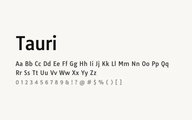
A compact, quietly efficient humanist sans with a single weight that punches well above its simplicity for text and UI use.
About
Tauri's slightly condensed proportions allow for comfortable line lengths without sacrificing legibility, making it a practical choice for interface design and longer-form reading. Its restrained personality means it sits unobtrusively behind content rather than calling attention to itself. The lack of weight variants is a genuine limitation for complex typographic hierarchies.
Classification
Tauri is a compact, single-weight humanist sans-serif with subtly condensed proportions and clean, economical letterforms. It prioritises readability and quiet efficiency over personality.
Weights
Regular
Languages
LatinLatin Extended
Tags
sans-serifhumanistbodytextneutralcleanscreenfreeopen-source