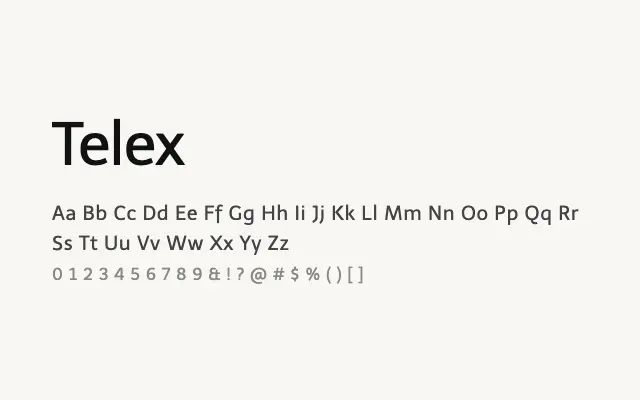
A no-nonsense single-weight humanist sans designed foremost for screen legibility and comfortable extended reading.
About
Telex prioritises functional clarity over stylistic distinction, with open letterforms and generous spacing that hold up well at body text sizes on screen. Its single-weight limitation is a practical drawback for projects requiring typographic hierarchy, but within its role as a body text workhorse it performs reliably. It suits content-heavy websites, documentation, and interface body copy where readability is paramount.
Classification
Telex is a single-weight humanist sans-serif designed with screen legibility as its primary concern, featuring open apertures and comfortable spacing. Its unpretentious, workhorse character suits body and interface text.