Tenor Sans
sans-serifgeometric sans
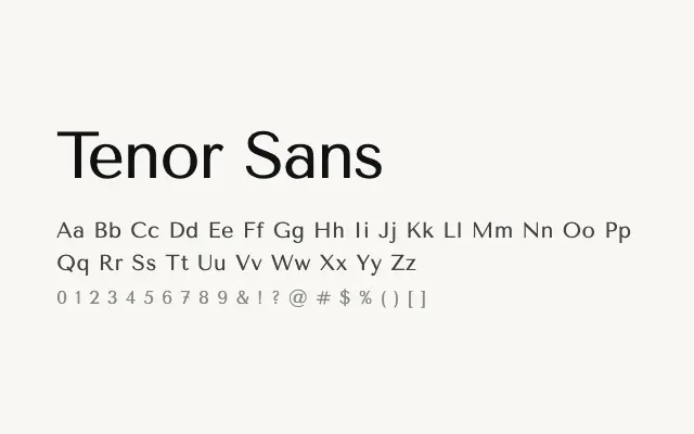
A quietly sophisticated geometric sans with an elegant restraint well suited to editorial and fashion contexts.
About
Tenor Sans offers a refined alternative to more rigid geometric typefaces, balancing structural clarity with a gentle warmth in its letterforms. Its single weight limits versatility but makes it a strong choice for headlines, logotypes, and light editorial layouts where subtlety is valued. The Cyrillic support extends its usefulness across multilingual European projects.
Classification
Tenor Sans draws on geometric principles with clean, near-circular curves and minimal stroke contrast, giving it an elegant, understated quality. The design sits closer to a refined humanist geometry than a strictly mechanical grotesque.
Weights
Regular
Languages
CyrillicLatinLatin Extended
Tags
sans-serifgeometriceditorialbrandingheadlinecleanneutralfashionfreeopen-source