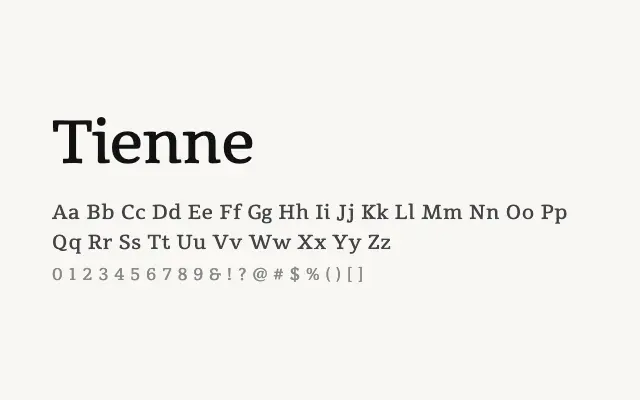
A solid transitional serif with a satisfying jump from Regular to Black, making it versatile for both text and display use.
About
Tienne's moderate contrast and generous x-height keep it legible in running text, while its Bold and Black weights give it real presence as a headline face. It suits editorial layouts, long-form publishing, and branding projects that need a single serif family to carry both body and display roles. The Latin-only script support keeps it best suited to Western European typography.
Classification
Tienne is a sturdy serif with transitional characteristics, featuring moderate contrast between thick and thin strokes and a relatively large x-height that aids readability. The three-weight range from Regular to Black gives it a pronounced tonal spread for a typeface with limited variants.