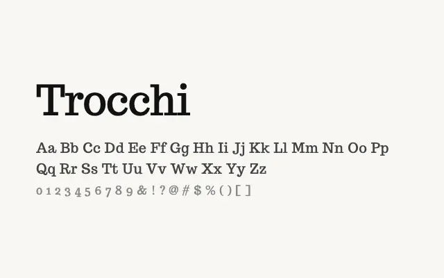
A stately single-weight display serif with an early twentieth-century editorial character.
About
Trocchi draws on the tradition of dignified book and display serifs, with open proportions and subtle old-style influences that read beautifully at larger sizes. Its single regular weight limits functional range but gives the typeface a focused personality well suited to mastheads, chapter headings, and brand identities with a literary or heritage feel. It works best when paired with a more utilitarian text face for body copy.
Classification
Trocchi is a single-weight display serif with generous proportions, low stroke contrast, and a slightly antiquarian quality reminiscent of early twentieth-century book typefaces. Its restrained elegance lends itself to editorial and branding contexts rather than extended body text.