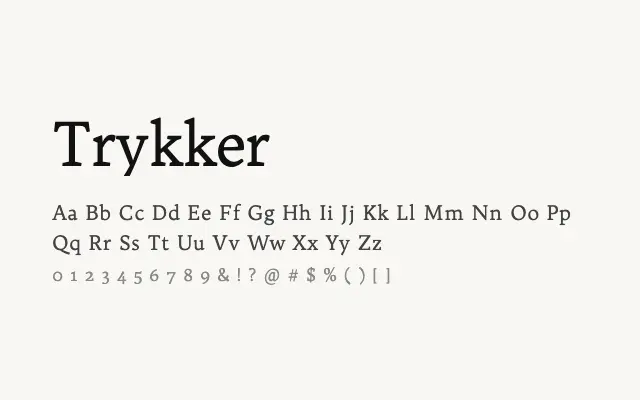
A quietly classical single-weight text serif designed for comfortable reading in body copy.
About
Trykker is a modest, well-proportioned humanist serif built primarily for text use, with stroke contrast and letterform construction that prioritise readability over display flair. Its single weight limits its flexibility, but within that constraint it performs reliably in editorial body text, long-form digital reading, and book-style layouts. The name and design sensibility suggest Scandinavian influences, with a clean pragmatism typical of that tradition.
Classification
Trykker is a single-weight text serif with moderate contrast and classical proportions, designed with care for legibility in running text. Its restrained design is rooted in the humanist serif tradition without being overtly stylised.