Unica One
displaycondensed display sans
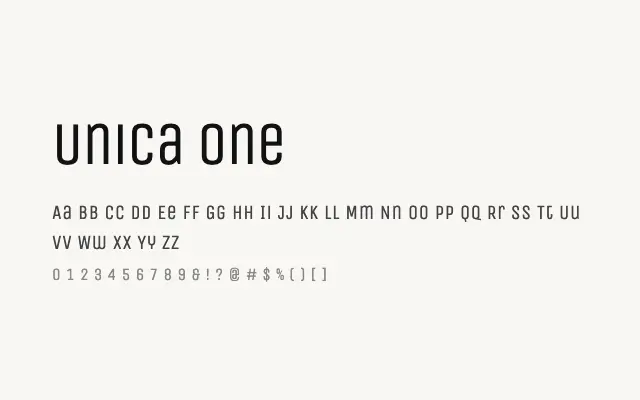
A crisp condensed display sans with Art Deco overtones, built for impactful headlines in tight spaces.
About
Unica One's narrow geometry and uniform stroke weight make it ideal for bold editorial headers, titling, and branding work where vertical rhythm matters. Its clean construction means it reads well at large sizes on screen and in print alike. Vietnamese support broadens its appeal for multilingual South-East Asian publishing and digital projects.
Classification
Unica One is a tightly spaced, condensed display sans-serif with clean, rational strokes and a hint of Art Deco geometry. Its narrow proportions and even weight make it highly efficient for headlines with limited horizontal space.
Weights
Regular
Languages
LatinLatin ExtendedVietnamese
Tags
displaycondensedgeometricsans-serifheadlinebrandingpostercleanfreeopen-source