seriftransitional serifitalic
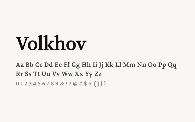
A dependable text serif with modest contrast and solid construction, built to perform reliably in body copy.
About
Volkhov is a workhorse text serif that prioritises legibility and economy on screen and in print. Its moderate stroke contrast and sturdy serifs hold up well at smaller sizes, making it a reliable choice for long-form editorial, books, and articles. The four-style family — regular and bold in roman and italic — covers the essentials without excess.
Classification
Volkhov is a sturdy, text-optimised serif with moderate contrast and robust stroke widths designed for sustained readability at small sizes. Its forms have a slightly Eastern European flavour appropriate to its Cyrillic-focused origins.
Weights
RegularBold
Languages
Latin
Tags
seriftextbodytransitionaleditorialworkhorsescreenmultilingualfreeopen-source