Wellfleet
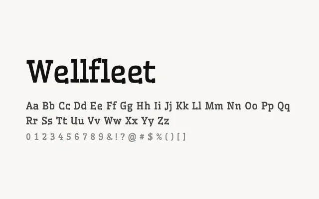
A characterful slab serif with mid-century American wood-type warmth and confident, open letterforms.
About
Wellfleet channels the pragmatic charm of vintage American signage and print ephemera, making it a natural fit for craft branding, editorial headlines, and packaging that wants a trustworthy, grounded aesthetic. Its humanist proportions keep it from feeling mechanical or cold, adding warmth that purely geometric slabs often lack. The single weight limits its flexibility in multi-level typographic systems.
Classification
Wellfleet is a sturdy, characterful slab serif with humanist proportions and moderate stroke contrast, evoking mid-century American wood type and signage lettering. Its robust slab serifs and open apertures give it strong legibility and personality at display sizes.