Wendy One
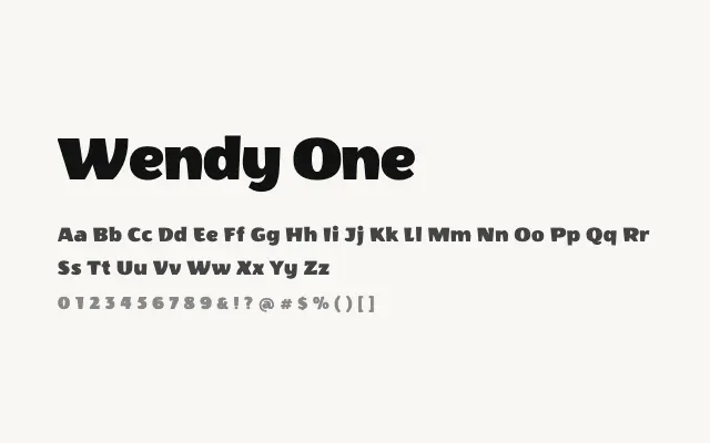
A bold, friendly display sans-serif with consistent strokes and an approachable geometric warmth suited to confident headlines.
About
Wendy One strikes a balance between geometric structure and humanist softness, giving it broader appeal than more rigidly constructed display faces. It works well in children's publishing, consumer branding, and social media headers where clarity and personality need to coexist. The single weight means designers must rely on size and colour rather than weight contrast to build typographic hierarchy.
Classification
Wendy One is a bold, slightly condensed sans-serif with soft geometric tendencies and a friendly, approachable character built around consistent stroke widths. Its single bold weight positions it as a confident headline face rather than a text workhorse.