Yanone Kaffeesatz
Google Fonts · Jan Gerner · 2004
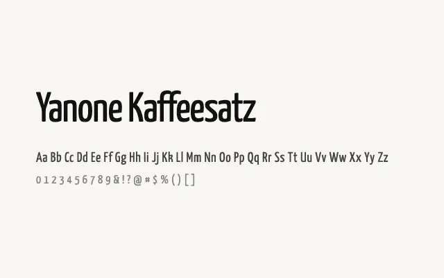
A characterful condensed grotesque inspired by early twentieth-century European café and poster typography, combining narrow proportions with considerable charm.
About
Yanone Kaffeesatz takes its cues from the informal hand-lettered signage and café menus of pre-war Central Europe, giving it a warmth that most condensed grotesques lack. The tight spacing and upright stance make it highly efficient for headlines, pull quotes, and display settings where horizontal space is limited. It has become a popular choice for editorial mastheads, packaging, and any project seeking a retro-inflected but clean aesthetic.
Classification
Yanone Kaffeesatz is a narrow, low-contrast grotesque with a warm, informal quality drawn from early twentieth-century café and poster lettering. Its tight proportions and even colour make it highly effective at large display sizes.