G2 Hyper
Gruppo Due · Massimiliano Audretsch · 2026
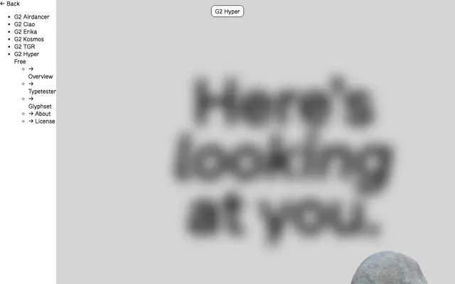
A hyperlegible sans designed for the 2026 Circulating Copies exhibition, built around principles from the Braille Institute to reduce character confusion.
About
Created by Massimiliano Audretsch with spacing and kerning by Igino Marini, G2 Hyper draws on Braille Institute legibility guidelines to distinguish commonly confused characters such as O, 0 and Q, or I, l and i. Open apertures and carefully controlled proportions support recognition across a wide range of reading environments. Offered in two styles, Visible and Visible Slanted, it is available free under the SIL Open Font Licence.
Classification
G2 Hyper is a humanist sans designed around hyperlegibility principles, with open apertures and strongly differentiated letterforms that prioritise clarity and accessibility over geometric purity.