G2 TGR
Gruppo Due · Massimiliano Audretsch · 2016
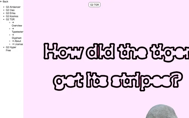
A humanist sans designed in-house at Gruppo Due from 2016, characterised by narrowing strokes at junctions to aid legibility at small sizes and assertive sharpness at display scales.
About
Developed initially for Gruppo Due's own project work, G2 TGR was refined over several years before being offered commercially. Four weights from Light to Bold come with matching italics, and a monospaced variant mirrors the same weight range. The narrowing line width at stems and junctions is a deliberate structural decision, giving the typeface both density at text sizes and a distinctive, slightly tense quality at larger settings.
Classification
Gruppo Due describe it explicitly as a humanist sans serif, with characteristic narrowing stroke widths at stems and junctions and snappy, sharp endings rather than neutral grotesque uniformity.