Rupta
Güneş Muhittin · Muhittin Güneş · 2025
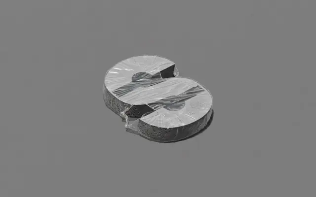
A deconstructivist grotesque by Muhittin Güneş that applies controlled fracture to letterforms without surrendering structural legibility.
About
Sixteen cuts span Thin to Black across upright and italic styles, giving the family broad weight coverage for display and editorial use. The design concept frames each letter as a form under pressure, where surface ruptures are introduced within a precise underlying structure rather than at random. The result sits somewhere between a straight grotesque and a more overtly expressive display face.
Classification
The foundry classifies it as Experimental Sans; it operates as a grotesque with deliberately fractured surface detail, sitting between systematic grid logic and deconstructivist disruption.