Zermatt
Güneş Muhittin · Muhittin Güneş · 2019
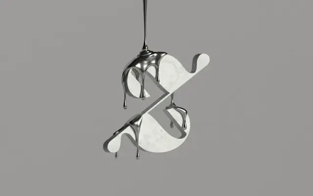
A sharp, high-contrast display serif by Muhittin Güneş, built for editorial work that favours precision and tactile restraint over decorative excess.
About
Zermatt runs across 14 cuts — seven weights from Thin to Black, each with a matching italic — and is shaped by what the designer describes as the point where molten metal meets a sharp edge. Its curves are deliberate rather than expressive, kept tight to serve as a neutral but distinctive base for editorial and typographic messages. Released in 2019 and carrying 512 glyphs, it is positioned for high-end contexts where texture and discipline matter more than personality.
Classification
The foundry classifies it as Display Serif. Its emphasis on sharp tension, precision and editorial restraint aligns it firmly with high-contrast display serifs rather than text-optimised styles.