Animo
Heavyweight · Jan Horčík, Arnaud Chemin · 2024
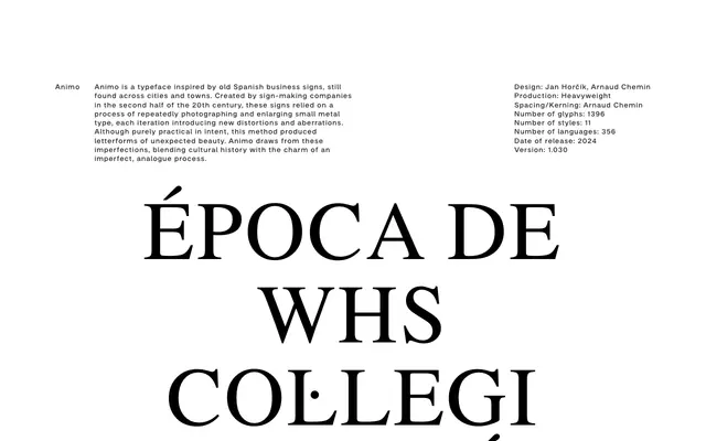
A display typeface drawn from the distorted letterforms of mid-20th century Spanish sign-making, where repeated photographic enlargement of metal type produced unintended but distinctive aberrations.
About
Designed by Jan Horčík and Arnaud Chemin, Animo traces its origins to Spanish business signage produced in the latter half of the 20th century, where sign-makers used iterative photographic enlargement of small metal type, each pass accumulating optical distortions. The result is a family of 11 styles across 356 languages and 1,396 glyphs that preserves the charm of that analogue process without mimicking it literally. It sits naturally in editorial, branding and display contexts that call for cultural texture and historical grounding.
Classification
Animo is a display typeface derived from the distorted letterforms produced by repeated photographic enlargement of metal type, giving it a rough, analogue character rooted in mid-20th century Spanish sign-making tradition — placing it firmly in the vernacular display category.