Atlantic
Heavyweight · Jan Horčík, Arnaud Chemin · 2022
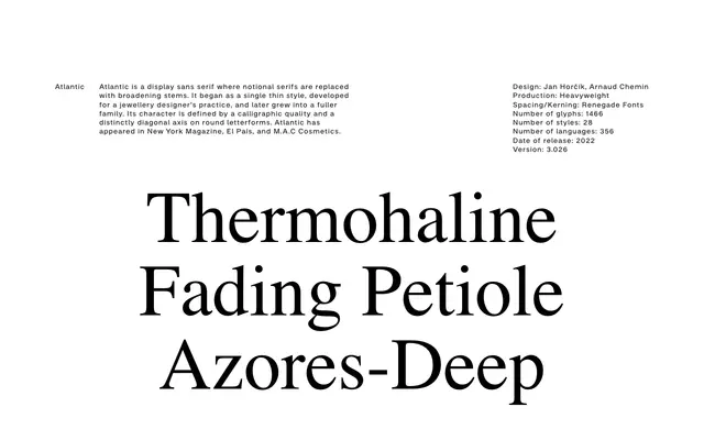
A display sans with broadening stems in place of serifs, defined by a calligraphic quality and a pronounced diagonal axis on round letterforms.
About
Originating as a single thin style made for a jewellery designer, Atlantic grew into a 28-style family covering 356 languages and 1,466 glyphs. Its distinguishing feature is the way stems broaden at terminals rather than terminating in conventional serifs, producing a calligraphic warmth that reads distinctly at display scale. The family has been used editorially in New York Magazine and El País, and commercially by M.A.C Cosmetics.
Classification
Classified as a display sans serif by the foundry itself; stems broaden at terminals in place of serifs, giving a calligraphic quality akin to a flared or optically-serifed grotesque at display sizes.