Cigars
Heavyweight · Jan Horčík · 2021
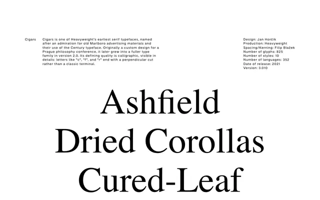
A calligraphic serif with perpendicular terminal cuts, rooted in the Century typeface tradition and originally drawn for a Prague philosophy conference.
About
Designed by Jan Horčík, Cigars takes its name from old Marlboro advertising and its use of Century, a lineage visible in the overall construction but departed from in the details: terminals on 'c', 'f' and 'r' are cut perpendicularly rather than finished in the classical manner. Version 2.0 expanded the original conference commission into a fuller family, now at ten styles across three weights with coverage for 352 languages. The result is a literary serif with enough warmth for long-form text and enough idiosyncrasy for editorial display work.
Classification
Cigars draws on the Century typeface lineage but its defining characteristic is calligraphic construction, with perpendicular terminal cuts on letters like 'c', 'f' and 'r' rather than classic bracketed or ball terminals.