Clin
Heavyweight · Filip Matejíček, Jan Charvát · 2026
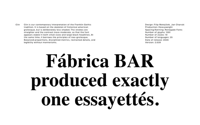
A contemporary grotesque drawing on the Franklin Gothic skeleton, reduced in shading and softened in contrast to perform evenly across body text and large-scale display.
About
Designed by Filip Matejíček and Jan Charvát at Heavyweight, Clin strips back the historical shading of American grotesque to produce straighter strokes and more moderate contrast. The result holds up at small sizes and reads cleanly in heavy black headlines without tipping into either direction. Neo-grotesque principles of balanced proportions and disciplined metrics are folded in, keeping mannerism out of the equation across its 10 styles and 35 language coverage.
Classification
Clin is grounded in the American grotesque tradition, drawing from Franklin Gothic's skeleton while reducing shading and contrast. It incorporates neo-grotesque discipline — balanced proportions and restrained details — placing it firmly in the grotesque sans-serif subcategory.