Left
Heavyweight · Filip Matejíček · 2014
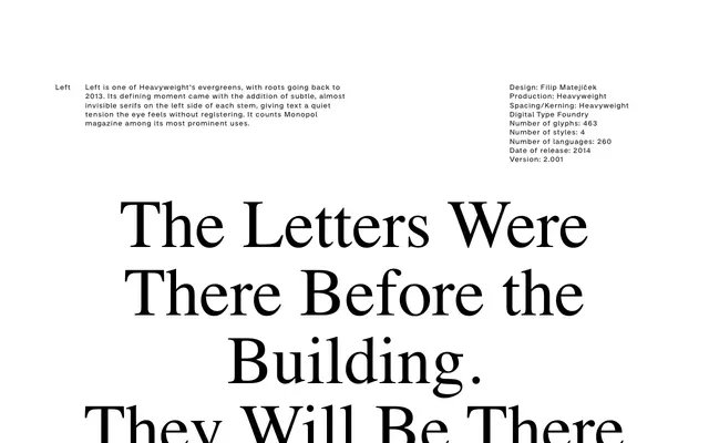
A semi-serif text typeface that places barely-visible serifs on the left side of each stem only, creating a subliminal visual tension that registers in the reading experience without being consciously noticed.
About
Designed by Filip Matejíček and released by Heavyweight in 2014, Left carries serifs on only one side of each stem, a device so restrained that readers feel rather than see the effect. With four styles covering 463 glyphs across 260 languages, the family is narrow in weight range but precise in intent. Monopol magazine is among its most prominent users, situating it firmly in European editorial contexts.
Classification
Left features subtle, almost invisible serifs on the left side of each stem only, making it a distinctive semi-serif or partial-serif design that occupies the boundary between sans and serif classification. The serifs function as a typographic tension device rather than a conventional stroke-finishing element.