Nuckle
Heavyweight · Filip Matejíček, Jan Charvát · 2011
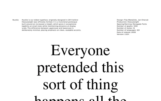
A functional grotesque originally drawn in 2011, built on a tall x-height for strong legibility at small sizes without sacrificing display presence.
About
Designed by Filip Matejíček and Jan Charvát, Nuckle predates Heavyweight's formal founding and was substantially revised for its 2026 release. The tall x-height keeps lowercase forms open and readable at small text sizes, while the deliberately narrow gap between uppercase and lowercase cap heights produces a calm, even colour on the page. With 1,095 glyphs across 301 languages and 16 styles, the family is built for broad multilingual deployment.
Classification
Described explicitly as a functional grotesque built around an increased x-height, with minimal uppercase-to-lowercase differentiation, placing it firmly in the grotesque sans-serif tradition.