Pano
Heavyweight · Filip Matejíček · 2015
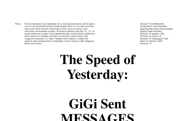
A wide-proportioned humanist sans originating from a racing bike logotype, offered in four styles suited primarily to display and headline use.
About
Drawn by Filip Matejíček and released in 2015, Pano grew from a logotype commission for a cycling brand, its notably wide proportions a direct inheritance from that brief. The design pairs low contrast and vertically terminated strokes with humanist details including a double-storey 'a', a characterful 's', and an expressive ampersand, keeping it distinct from geometric sans families. A high x-height extends its usefulness into short text settings, though its strongest register remains poster, book title, and magazine spread work.
Classification
A low-contrast sans serif with humanist details such as a double-storey 'a', organic 's', and expressive ampersand, distinguishing it from geometric constructions. Smooth arm-to-stem transitions and vertically terminated strokes place it firmly in the humanist sans tradition.