Bonkus
Herzberg Design · 2020
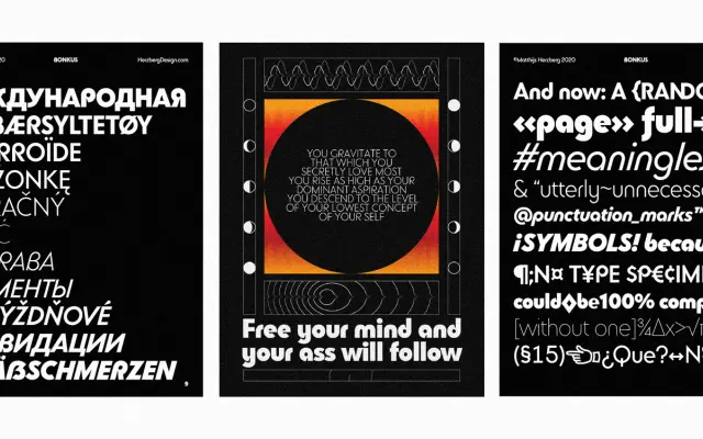
A geometric sans-serif with 1970s 'bent-tube' DNA, drawing on ITC Bauhaus, Blippo and Ronda, offered in six weights with italics and a variable font file.
About
Inspired by the rounded, bent-tube lettering of 1970s typefaces such as ITC Bauhaus and Blippo, this geometric sans aims for a more balanced and versatile take on that era's personality. Six weights from Thin to Black each have optically adjusted italic counterparts, and the family ships with a variable font file. Four stylistic sets and 54 uppercase discretionary ligatures allow the aesthetic to shift considerably, from restrained sub-headers to high-energy display settings, with Latin Plus and Basic Cyrillic covering over 200 languages.
Classification
Explicitly described as a geometric sans-serif, with '70s 'bent-tube' inspirations from ITC Bauhaus, Blippo and Ronda placing it firmly in the geometric tradition with a display-leaning personality.