Fang
Herzberg Design · Herzberg Design · 2022
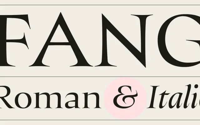
A two-style display serif drawing on Roman inscriptions, Renaissance printing and the lettering of Helmut Salden, built around a distinctive three-way contrast structure.
About
The design pairs exceptionally wide Roman lowercase letterforms with a heavily condensed italic, creating a sharp typographic contrast between the two styles. Its three-way contrast structure of thick strokes, thinner strokes and hairline endings is offset by subtly concave stems and curved serif feet, introducing a calligraphic warmth that softens the inherent rigidity of high-contrast display type. The family ships with small capitals, oldstyle and lining figures, standard and discretionary ligatures, and broad Latin language support.
Classification
Classified as display serif with a distinctive three-way contrast structure: thick strokes, thinner strokes, and hairline endings. Informed by Roman inscriptions, Renaissance printing and calligraphic lettering, placing it firmly in the high-contrast display serif tradition.